
You're getting traffic. Maybe decent traffic. But the contact form sits empty and the phone doesn't ring the way you'd expect. Before you assume you need more visitors, it's worth checking whether the ones you already have can actually tell what to do once they land.
Your homepage doesn't say what you do, fast enough.
If someone has to scroll or squint to figure out whether you're a trainer, a sitter, or a daycare, they've probably already left. That sentence needs to live at the top, in plain language.
There's no obvious next step.
A phone number buried in a footer isn't a call to action. Every page should have one clear thing you want a visitor to do next, and it should be easy to find without hunting.

Pricing is a total mystery.
You don't have to list exact numbers if you don't want to, but "contact for pricing" with zero context sends a lot of people straight to a competitor who at least gives a starting range.
The photos aren't real.
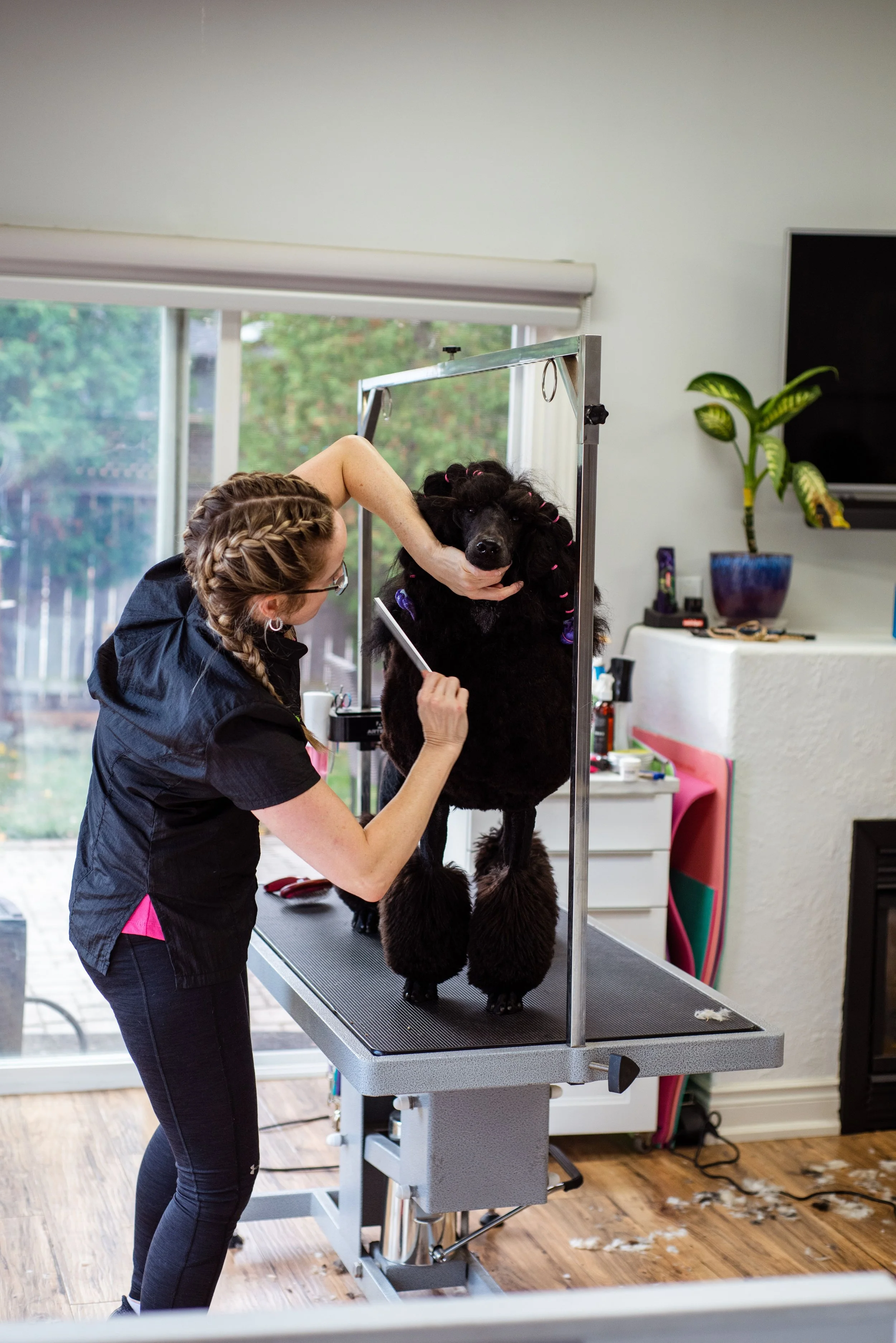
Stock photos of dogs that have never set foot in your business are more noticeable than people think. Real photos of your actual space and the animals you work with do more trust-building than almost anything else on the page.
Mobile is an afterthought.
Most pet parents are searching for you from their phone, tired, mid-crisis, standing in their kitchen with a chewed shoe in hand. If your site is slow or hard to tap through on mobile, you're losing them right there.
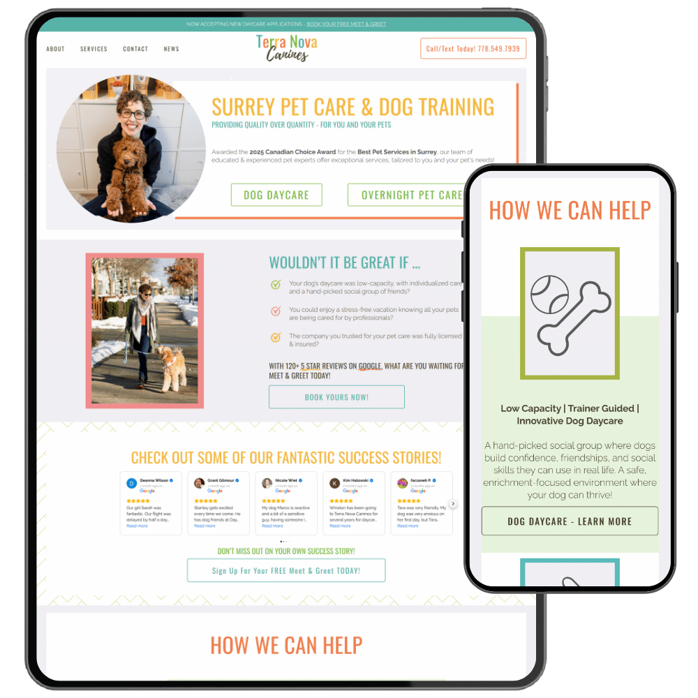
Testimonials are missing, or too vague to matter.
"Great service!" doesn't do much. A specific quote about a specific result is worth ten generic ones.
Your service area isn't clear.
If someone can't tell in five seconds whether you serve their neighborhood, they'll assume you don't and move on.
There are too many choices with no guidance.
Five services, three contact methods, and two different booking links can feel like more options, but it usually just creates hesitation. Fewer, clearer paths convert better.
It hasn't been touched in years, and it shows.
Outdated design doesn't just look dated, it quietly signals that the business behind it might be too. That's often not true, but perception does a lot of the work here.
None of this requires starting over.
Most of the time it's a handful of specific, fixable things. If you want a second pair of eyes on which of these apply to your site, that's exactly what a quick audit is for.







If you've never done this before, the number of decisions can feel bigger than it needs to be. Here's the version without the overwhelm.